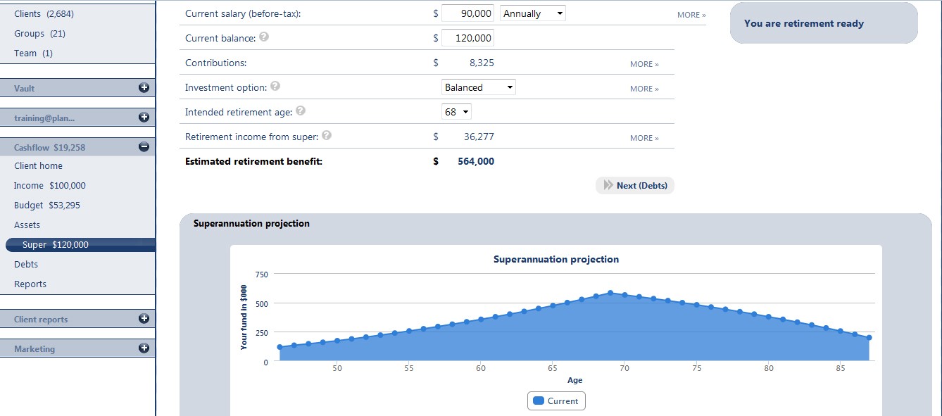
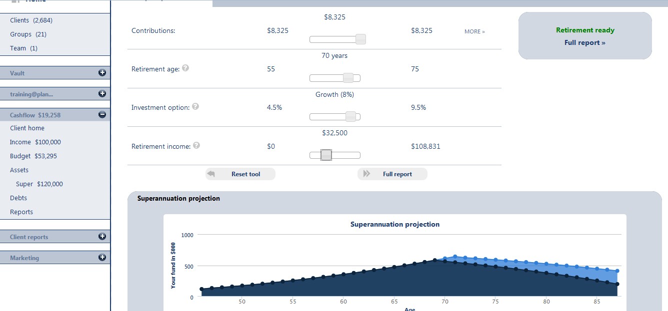
.... the Financial Tools on this website will produce such graphs but ones based solely on YOUR financial position and needs. Click on the following images to view a bigger version but both are from inside the Tools on this website - the main difference is retiring at 70 rather than 68. Use these graphs to "stress test" the longevity of your assets in retirement.
"Over 13 years of writing about pensions the graph below is one I have barely seen, but over the last few weeks it has popped up three times.
Twice it was used to illustrate post-retirement product innovation and once on TV (7 News) to illustrate a point about the benefits of people retiring at 70 instead of 65, (graph below created by Deloitte).

Its rarity has much to do with there being close to 1000 accumulation funds fighting for the public's attention, but few post-retirement options. Its most common usage has been in one-on-one chats with financial advisers to create tailored retirement solutions and in online retirement calculators, but it surely should be more widely seen as a health check/warning for investors."
David Rowley
22-4-2014
Source: www.investmentmagazine.com.au
17th-May-2014 |